CGI Momentum: Modernizing a Legacy Platform
Acting Product Owner, UX — Led vision, backlog, and delivery for a two-year federal modernization initiative focused on clarity, consistency, and scale.
At a Glance
Project Overview
- Client: CGI Momentum
- Role: Acting Product Owner, UX
- Timeline: 2015-09 – 2017-11
- Team: 8 developers, 2 PMs, 2 designers, executive stakeholders
Tools & Methods
- Adobe
- Axure
- User Interviews and Testing
- Executive Alignment
- Design Thinking Workshops
Challenge
The platform’s complexity had grown over two decades — multiple legacy workflows, inconsistent design, and technical debt slowing modernization.
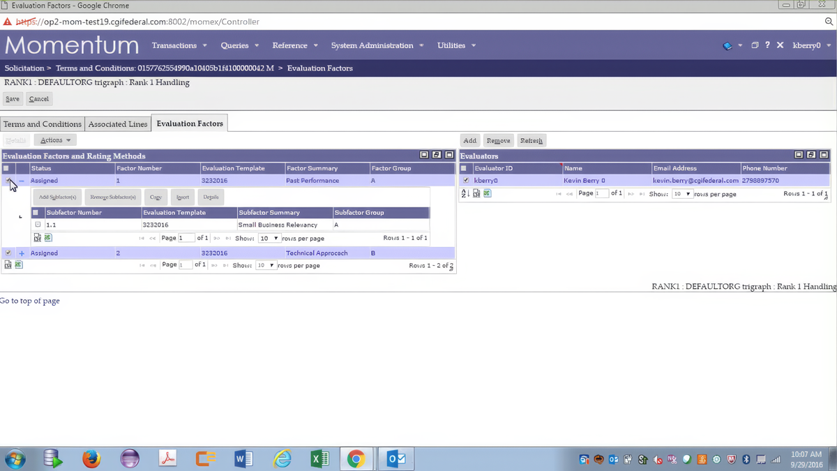
- Legacy complexity: A monolithic web app supported intricate federal and state accounting workflows, slowed by years of feature creep and no dedicated UX leadership.
- Redundant taxonomies & deep navigation: Five-tier menus and multi-step object relationships created confusion and inefficiency.
- Non-standard forms & layouts: Inconsistent inputs and validation patterns reduced task success and user trust.
- Performance drag & high support volume: Slow load times and unclear workflows increased tickets and stalled adoption.
Momentum needed a clear UX north star, guided workflows, and shared design patterns to make modernization scalable.
Challenge Examples
Without a clear strategy, every fix felt like Whac-a-Mole — endless firefighting that drained focus and slowed modernization.
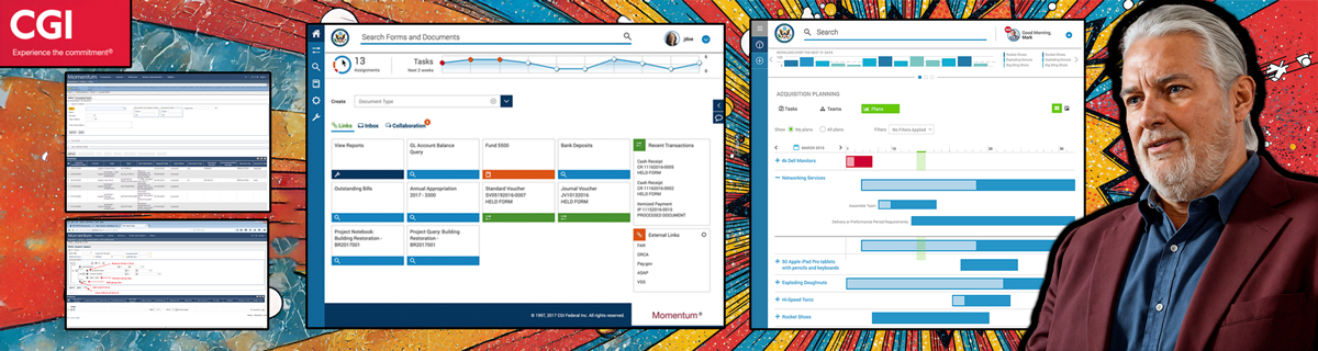
A cluttered, outdated interface turned even simple tasks into guesswork — slowing teams and eroding confidence.
After discovery, workflows were rebuilt around real user tasks — helping examiners stay organized, confident, and in flow.
Vision & Objectives
- Modernize the platform on reusable components to increase speed, consistency, and maintainability.
- Guide users through core workflows to reduce support volume and improve task completion.
- Standardize patterns, search, and contextual help to streamline training and minimize rework.
A clear vision for modernization — focused on consistency, clarity, and scalable design across a complex federal platform.
Approach
- Defined the UX north star and acceptance criteria for each release, ensuring alignment across design, product, and engineering.
- Led discovery → prioritization → sprint goals to balance user insights with delivery constraints.
- Managed roadmap trade-offs between expert efficiency and guided usability to serve both advanced and novice users.
- Approved readiness through prototypes, usability validation, and development sign-off.
By embedding design ownership within agile delivery, the team accelerated modernization and unified cross-functional decision-making.
Approach Examples
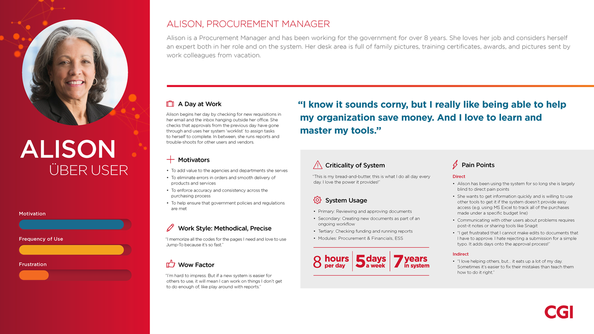
Persona (Alison):Defined five personas by mastery level to steer roadmap and onboarding strategy.
Streamlined examiner and acquisition tools into a cohesive flow — reducing clicks, cutting duplication, and improving task confidence.
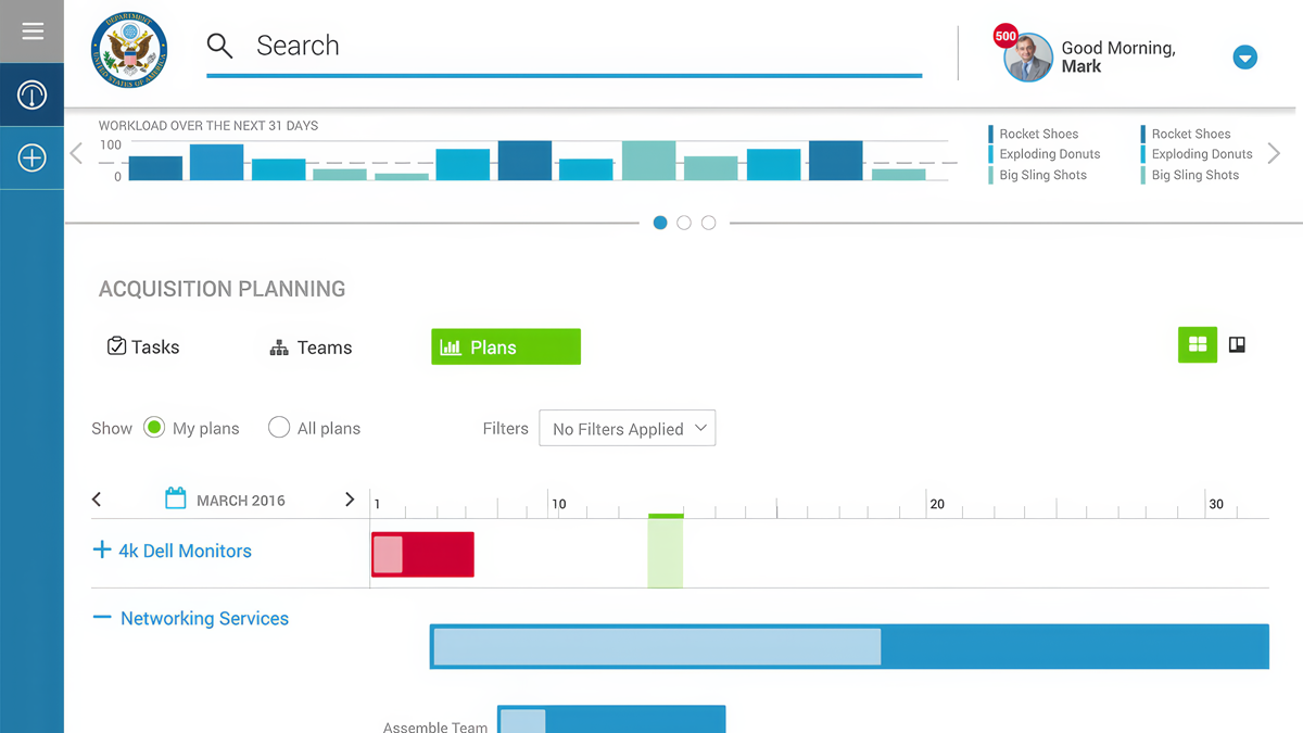
Planning Timeline (Final): Established DATA Act–aligned transparency so teams could plan capacity with confidence.
Transformation
- Identified and resolved 12 core pain points driving 80% of user friction — aligning teams on what to fix first.
- Prioritized and sequenced the backlog with Product and Engineering across four coordinated release waves.
- Embedded rapid prototyping loops with users — insights from testing directly informed sprint planning.
- Standardized the UI through a 508-compliant React component library to ensure consistency and accessibility.
- Delivered guided workflows, search, and contextual help across acquisition and planning, simplifying complex user tasks.
Momentum evolved from a fragmented legacy system to a unified, data-informed platform — establishing a sustainable model for continuous improvement across the federal product suite.
Outcomes
Takeaways
- Scale innovation through systems, not screens. Building reusable components and design standards created momentum beyond individual releases.
- Prototype early to build trust. Mid- and high-fidelity prototypes surfaced risks faster and aligned executives around evidence, not assumptions.
- Anchor decisions in metrics and user insight. Quantitative data and SME feedback shaped priorities and reduced rework.
- Governance accelerates quality. Establishing a design standards council and regular 508 reviews ensured sustainable improvement and accessibility compliance.
Modernization succeeded not by replacing technology—but by uniting design, product, and engineering around shared systems, measurable outcomes, and continuous improvement.